Forms
A form is a collection of inputs that are thoughtfully constructed to enable users to input and select information effectively.
To create a successful form you need to consider using the correct structure, interface elements, labels and interactions. We will outline guidelines for these below.
By adhering to these guidelines, our forms will provide clear, consistent, and accessible feedback to users, ensuring a better overall experience even when errors occur. This includes robust handling of both synchronous validations and asynchronous validations (such as API lookups) for fields like email address verification.
Guidelines
Forms are used to get multiple pieces of information. For this, we need to be specific with what information we require to guide the user in completing the form. Outside of choosing the right UI elements for this, we need to ensure they are labeled properly - and if necessary include placeholder and descriptions.
Form Anatomy

There are many different UI elements to choose for your form, including; input fields, checkboxes, radio buttons, date pickers, buttons.
Labels
Labels should always be present and clear to what is required from the user.
| Type | Visual | Usage | Example |
|---|---|---|---|
| Text input |  | To allow users to input a single line of text | First and last name inputs, email addresses, etc |
| Selection |  | Select information from a pre-defined selection of inputs various different types of components. Use this for 5 or more options | Choosing start and end dates (and times), selecting options from a dropdown |
| Selection controls (single) |  | When using a checkbox to allow the user to confirm a simple statement | "I understand that this will permanently change name's contract" |
| Selection controls (multiple) | 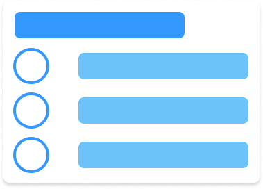 | If there are multiple selections that require controls under the same label (think of this as an open dropdown component) - use this instead of a dropdown with 4 or less options that may require further descriptions | Right to work status; Settled, Pre-settled, Not declared |
| Selection control (switch) |  | when you require a user to turn a feature on (which result in an action or further inputs being available) | Include terminated absences |
Input fields can have two types of labels (Top aligned and left aligned). This alignment can change depending on if you are looking to slow, or speed the user up when navigating your form. You must ensure that you do not mix these alignments in the same form.

Top-aligned labels
Top-aligned labels form an 'F pattern', following the path of a users eyes looking at the form. There is less visual distance between a label and its input with it stacked on top of it's own input.
Side-aligned labels
Side aligned labels form a 'Z pattern', following the path of a users eyes looking at the form. There is more visual distance and using more negative space to have the input alongside the label.
there are advantages and disadvantages to both of these label layouts. Typically top aligned forms are easier for a user to quickly fill in common pieces of information, whereas a side aligned allows users to quick scan the labels for a specific piece of information they may be required to change.
Consider both of these layouts when designing your form, is your form information gathering that is completed once as part of an action (absence booking, adjustment requests etc), or is this a form that will be revisited and changed over time (employee profile, contract details).\
Platform considerations
For mobile: ensure that all forms are using top-aligned labels, you have minimal horizontal width to accommodate for left-aligned labels. If you are worrying about the vertical space your form is taking on mobile, consider breaking your form into sections (see below).
Placeholder text
When you have additional information or helpful examples, include placeholder text to help users along.
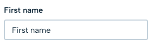
Remember that placeholder text is visually less important, low in contrast, and disappears once users enter anything. So do not include anything necessary to complete the field.
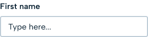
Placeholders


Placeholders serve as a secondary visual indicator and shouldn't replace a visible label for an input in a form. Use placeholder text as an example of the format required inside the field, eg DD/MM/YYY. Alternatively, use placeholder text as instructions for using the component or a prompt to what can be selected, eg 'Type here' in input fields and 'Select one' for select dropdowns.
Inline Hints
Where applicable, include inline hints or example text in form fields to guide proper input.
e.g. Barclays Bank
e.g. 01-02-03
e.g. 12345678
Inline hints
Main CTA Behavior
Button State
- The main CTA (Call To Action) button should never be disabled.
- This approach allows users to submit the form regardless of its current validity state.
Error Resolution Post-Submit
- If errors are present upon submission, the form will display the appropriate error messages below each problematic field.
- This approach avoids premature restrictions and reduces user frustration associated with disabled submit buttons.
Rationale
- Keeping the CTA always enabled allows for a smoother user experience, as users are informed of errors after their submission attempt rather than being prevented from submitting the form altogether.
Error handling
This section outlines the design patterns and guidelines for handling errors and validations in our forms. It focuses on the visual presentation of error messages and validation behavior.
Placement & styling
- Error and validation messages are displayed directly underneath the corresponding form element.
- Error text uses a red color to clearly signal an issue.
- We use font size 12px and normal weight across all forms to ensure legibility and consistency.
Email address not valid
Error message placement
Content
Remember that such messages are likely to invoke negative feelings, so be positive and focused on solutions to any problems. Messages should be concise, clear, and instructive.
Examples:
- “This field is required.”
- “Please enter a valid email address.”
- “This email address is already in use.”
Triggering Conditions
Errors are displayed when:
- The input does not meet the validation criteria.
- Required data is missing.
- Asynchronous validations (e.g., API lookups) indicate a problem.
Error Handling on Submit
- All errors are checked and displayed after the user submits the form.
- The first invalid field should receive focus automatically, helping users quickly locate and fix errors.
Validation
Required fields
Required fields in a form are automatically marked with a red 'required' label on the top right' to show that users must fill something in.
Required field
Inline validation
As the user goes through the form, they may focus on one field after another. If they, say, focus on an email field and then focus on another field without completing their email correctly (leaving a required field blank or some other error), the email field is marked as an error.
To show the error, the field is highlighted in red. The error overrides any help that was displayed and disappears after the user returns to the field and fixes the error.
Email address is required
onblur validation
Form submission validation
If a user misses errors created while navigating through the form (or never focuses on a field to produce the error), the form is also validated on submission. This validation highlights all fields with errors (again in red text).
If possible, use an Alert at the top to describe all the errors in the form.
- Name field is required
- Email address is required
- Address 1 field is required
- Address 2 field is required
Asynchronous Validation (API lookup fields)
Some fields require an asynchronous check, such as verifying whether an email address is already in use.
While the API lookup is in progress there could be a delay, consider displaying a loading indicator or a subtle message close to the field to inform the user.
If the API lookup fails or returns a validation error (e.g., email already exists), display the error message directly under the field using an Alert.
Sorry this email address is already in use.
API lookup error
Handling Delays
- Ensure that error messages for asynchronous validations are updated as soon as the API response is received.
- If the API request fails due to network issues or other errors, display a generic error message (e.g., “We’re unable to verify this information at the moment. Please try again later.”).
Feature specific behaviour
Annual leave
Default behaviour:
- When start date is selected, automatically populate Start Time and default to users Working Time Pattern.
- Automatically populate End Date to be the same day and End Time to be defaulted to users Working Time Pattern (current web behaviour).
- When user changes the End Date, automatically change the End Time to match Working Time Pattern, e.g. If the initial date had a WTP end time to be 17:00 but new date has WTP end time to be 15:00 default the End Time to match WTP of that specific day, which would be 15:00.
Manual time adjustment:
- User selects the Start Date and above behaviour is applied but manually adjusts either Start Time or End Time.
- When user changes the date after manually adjusting the End Time, time should remain as set by users - do not default to WTP. For mobile: ensure that all forms are using top-aligned labels, you have minimal horizontal width to accommodate for left-aligned labels. If you are worrying about the vertical space your form is taking on mobile, consider breaking your form into sections (see below).
Accessibility
- Error messages should be announced by screen readers.
- Ensure that the error state is easily distinguishable for users with visual impairments.
- Ensure placeholder passes accessibility requirements for contrast and screen readers.