Filtering
When launching a product into beta, it is important we inform users. It indicates that the feature is not yet fully developed and may contain bugs or other issues that could impact its functionality.
Guidelines
- A beta feature should always use the solid pink interactive pill to inform the user, within the page. This can then be paired with any of the other logos.
- There should always be an informational alert banner paired along side this.
- A beta feature should never use a non interactive logo on its own.
- A beta logo should never be used in Labs - use the Labs version of the logo instead.
Key filter types
Single
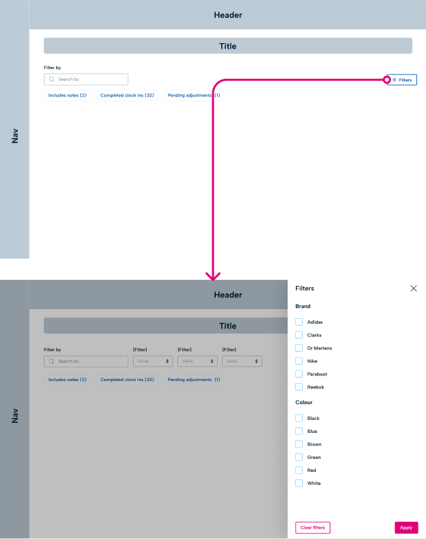
Allow users to filter the page by one specific value a category. Values from other categories can be selected alongside this to layer the filter. However, no two values from the same category can be selected together. Ensure that when you are using a single select, users do not expect to be able to filter by two different filters from the same category. These filters are best used for users looking for specific criteria, and not for comparing results. Use dropdown selects in a page view to single select. Use radio buttons inside a side drawer.
📱 Mobile considerations
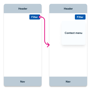
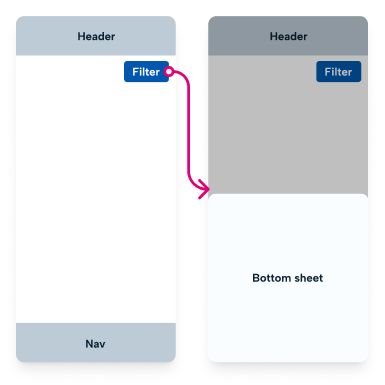
For mobile, single selects can be selected using a context menu from a screen. If a category has more than 5 values to select from, you can navigate to a new page or open a bottom sheet with these values present using radio buttons.
Multi
Multi filters allow users to filter content by multiple values within the same category. These can allow users to layer results together with conflicting values from the same category of information. Always ensure when using multi filters you are using additive filtering. ie, you add values to be filtered by selecting them, rather than unselected values you don’t want to filter. Use typeahead search in a page view to multi select. Use checkboxes inside a side drawer.
📱 Mobile considerations
For mobile, multi selects are used through navigating to a new page for a large number of values, or using a bottom sheet to present options.
Chips
Chips can be used as both single select and multi select filters. Chips offer the benefit of being able to see which values you can filter by, and select / deselect quickly with one tap or click. When using chips to filter, these may not have a specific category, so chips labels should be clear for predictable results for the user.
Placement
Filters should always be place high in the visual hierarchy. When using filters, apply immediately which should be viewed directly underneath these filters.
Mobile
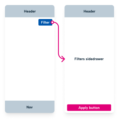
Similar to webapp, controls for filters should be high in the visual hierarchy including inside the header. This allows context menus to open above the content that will be filtered upon selecting a value. Controls to open a side drawer or a bottom sheet should also be placed here.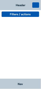
Activation
Mobile
Mobile activation
For single select filter of one category, use a context menu. The context menu should close and filter results immediately after tapping a value.