Range pickers
Overview
Selecting a range of dates allows users to select a specific period. Webapp users may use the date range picker component, which will allow them to select a range of dates inline, whilst the mobile apps leverage the components native to the device. This document will define how and when to use these date pickers.
Guidelines
Forms vs Filters
Range pickers can be used to filter down information to within a period, or can be used to select a date range as part of a form. When adding a range to a form, always ensure you use two single pickers on both webapp and mobile app.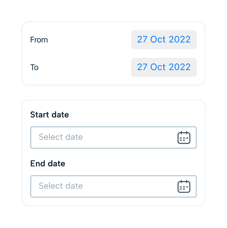
For filtering information, this is mostly done by date and not by time. You can use the date range component for this on Webapp and Android. iOS does not have a native range picker we are able to leverage, so you must use single date pickers to define your range.
Behaviour
For a form, the information that validates an entry into a date picker can vary; from working time patterns, conflicting absences or contract start dates. However there are some tables we can observe.
- Both the start and end ranges must be filled to submit a form.
- An end cannot be before a start and a start cannot be after and end (absences, shift)
- Two ranges cannot conflict in the same form (blip / break times).
These are all rules that must be observed to validate a form for submission. Validation should be done on blur of the component.
Picker validation
Users are allowed to break these rules, however they will not be able to submit the form and error messaging will be shown that directly describes the issues as well as possible. See the relevant components to see these error states. where possible, avoid these errors by leveraging available data (such as a WTP) to disable options for a user to select.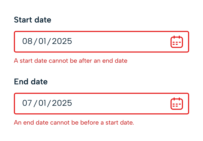
Populating forms
Where possible, always use a placeholder ‘select’ state for a picker to allow user to make the decision themselves. We want to make the process of inputing forms as easy as possible for our users. To do this, we can leverage the data we hold surrounding the user (or object) that a form relates to.
Examples: When selecting for an absence for somebody with a working time pattern, when you have selected the start date for the first time, auto populate the end date to be the same date. If you are inputing times for this absence, populate the start time to being the start pattern on the relevant day and the end time to being the end of the pattern on that relevant day. If a date is changed then auto populate the times to the relevant extreme of these days. (start time to start of WTP, end time to end of WTP). If a time picker has been manually changed, keep this change when a new date is selected, but error the component if this falls out of the new dates WTP. See more in forms
Accessibility
Look at the specific inputs and components for accessibility requirements.