File Upload
Overview
Definition
A temporary, full-screen UI layer that appears over the main interface of the app to indicate a process to the user. Initiated by the clicking on 'Add' or '+' CTA top open the layer / overlay.
Live Demo
[Add Storybook]
Anatomy
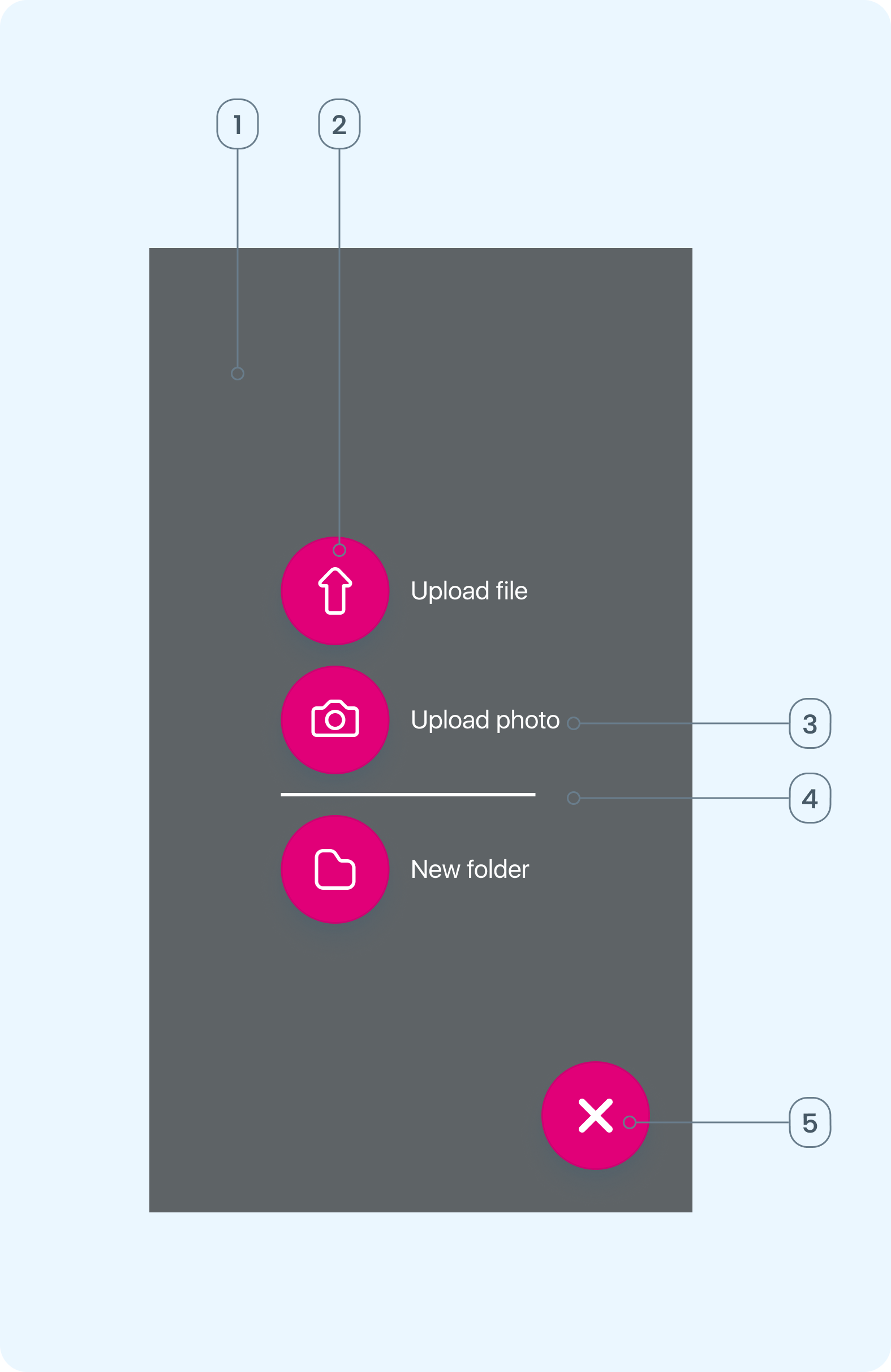
- Backdrop: Dark overlay that contains all call to action buttons.
- Action buttons with icons : Buttons used to provide explicit actions the user can take to either upload a file, upload a photo, create a new folder or to close the overlay.
- Label: Text representing the content of the action.
- Divider: Line to help define the button panel.
- Close Button Contains the content related to the active tab
Variants
iOS
The actions shown on iOS include being able to upload a photo. This is due to iOS photos being stored in photo app instead of a files location
- Upload file
- Upload photo
- New folder
- Close overlay
Android
The actions shown on android are upload file only. This is due to android photos being saved within the same location as all files.
- Upload file
- New folder
- close overlay
Guidelines
When to use
Use the file upload component where documentation is required or expected to complete or in support of a process.
Examples of document scenarios
- Right to work, Visas or Proof of identity
- Performance reviews, 1 to 1 meeting notes
- Sickness or absence; uploading fit notes, medical notes or return to work forms
When not to use
- If the process does not require documentation or image uploads
- When the content of information is already captured elsewhere in the system
Position
- There should be a maximum of 4 CTA in the upload file overlay. (Upload file, upload image, new folder, close button)
- The main CTA's to allow a user to begin a process, should be placed central within the overlay screen.
- The close CTA should be in the bottom right corner of the overlay screen.
- Avoid cluttering the overlay with secondary action buttons. In this instance only actions that being a process for the user to interact with.
Behaviour
Trigger
The overlay is initiated when the user clicks or taps the '+' Icon CTA on the previous screen. This actions signals the intent to upload a document or image related to workflow (employee profile, Documents, Employee Sickness)
The overlay appears in the foreground and includes;
- Upload file
- Upload image (iOS only)
- New folder
- Close
Interaction
While the overlay is active the background of the app is disabled to maintain focus on the overlay.
Users can
- Tap to browse and select files / images from their device.
- View / preview file name and type selected.
- add additional or remove files before submission.
- 'Upload' multiple files at once the files are selected and ready for upload.
Completion
Once the user uploads the file and confirms the submission of the upload;
- A progress bar loads within the file container. Once the upload is competed, a successful message appears and the file container turns to success colour token.
- The main CTA changes to 'Uploaded" with a tick Icon - on tap, the overlay closes, returning the user to the my documents screen.
- The upload is now visible in the folder.
Content
Only the CTA button options should be displayed on the overly with each button having a label that represents the content of the action.
Example: 'New Folder'
Accessibility
Maintain contrast and use of Primary action colour within the MUI / BUI tokens
Body iOS/Secondary 15 /20 - Using clear, readable font the library.
Screen reader compatibility
- All interactive elements (buttons, overlays, spinners, file inputs) use proper semantic tags / ARIA labels. This allows screen readers to announce the buttons and any warnings to users who rely on audio feedback.