App Bar (Mobile)
Last update: 21 Jan 2026
Overview
Definition
The App Bar is a persistent top-level UI component used to display contextual information and provide quick access to primary and secondary actions within a mobile screen. It provides consistency across the app experience and typically contains navigation controls (e.g. close or back), title and subtitle, and trailing actions.
Live demo
[ Add Storybook ]
Anatomy
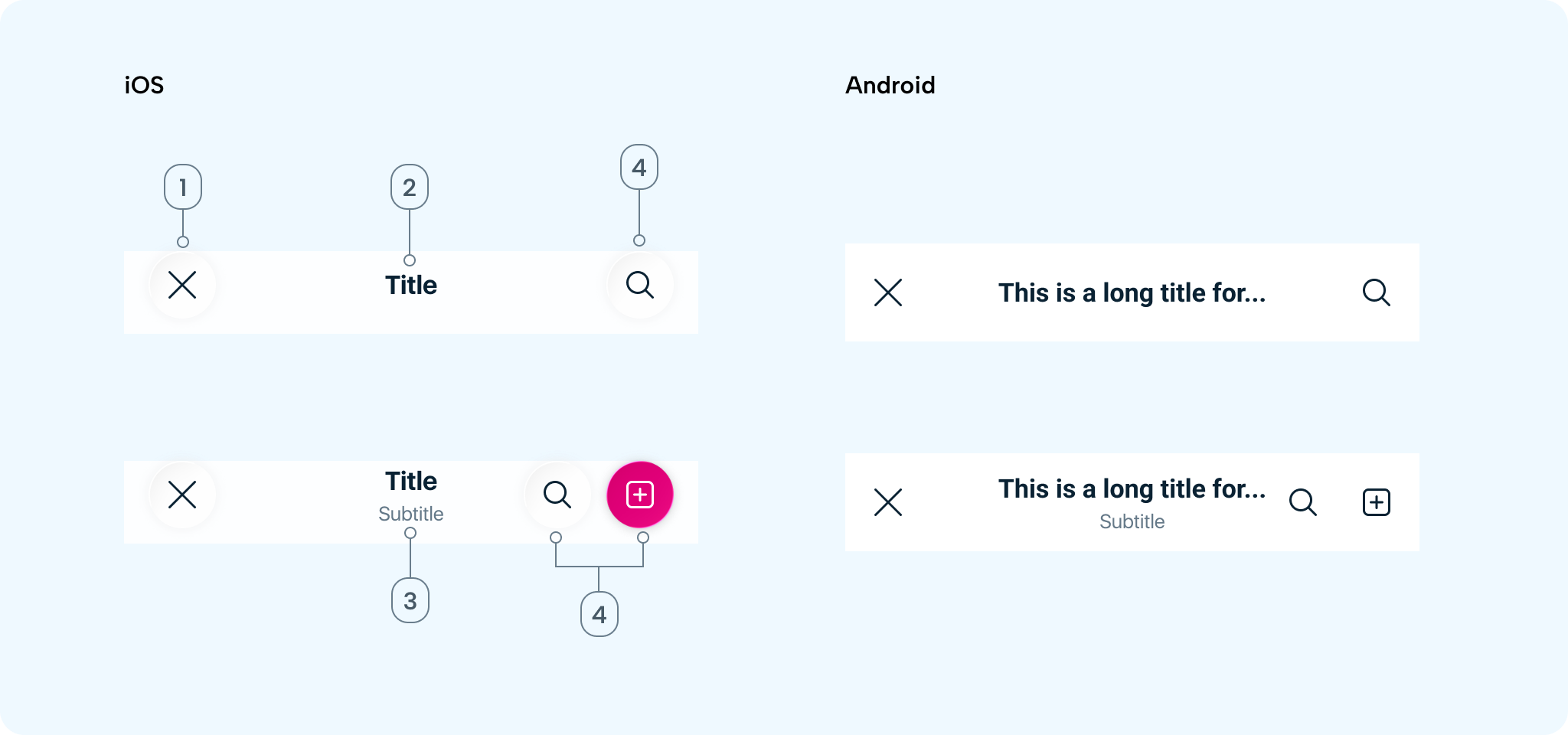
- Leading action: Usually a Close (
✕) or Back (<) icon positioned on the far left. Used to dismiss a modal or bottom sheet, navigate back, or exit the current screen. - Title: Communicates the primary context of the screen. Centre-aligned, single line only, truncated at the end when too long.
- Subtitle: Provides secondary contextual information related to the title or adds clarity. Centre-aligned, single line only, truncated at the end when too long. Do not use subtitles for actions or instructions. Avoid redundancy with body content. Example use cases:
Marketing Manager,3 selected,Step 3 of 5. - Trailing actions: One or two icon buttons providing contextual actions, positioned on the far right. Actions should be high priority and frequently used.
Variants
- No trailing: Leading action only
- Single trailing: Leading action + one trailing action
- Double trailing: Leading action + two trailing actions (iOS only)
- Two singles: Leading action + two distinct single icons in sequence
- Button style: Default (White) / Primary (Pink)
Sizes
- Height (excluding status bar): iOS: 54 pt, Android: 64 dp
- Width: Spans 100% of the device screen width
- Icon size: 24 × 24
- Touch target: iOS: 44 × 44, Android: 48 × 48
Guidelines
When to use
- Use an App Bar when a screen requires clear context or a title
- Primary or secondary actions are needed at the top level
- A user flow needs a close or back action
When not to use
- Avoid the App Bar when the screen is immersive or content-only
- Navigation is handled elsewhere (e.g. bottom navigation only)
- A custom header is required for branding or storytelling
Interaction & Behaviour
Interactions
- Tapping the leading icon navigates back or dismisses the modal
- Tapping trailing icons triggers contextual actions
- Title and subtitle are non-interactive
User actions
- Leading icon behaviour must always be predictable
- Trailing icons should represent frequently used actions, use a primary button only for high-priority actions
- Avoid overflow menus
Scroll behaviour
- Static - Remains fixed at the top
- Visual effect on scroll (iOS 26) - When the user starts scrolling content, the App Bar transitions from opaque to a blurred material background
Content
Title best practices
- Keep titles concise and descriptive
- Use sentence case or title case consistently
- Avoid verbs unless representing a state (e.g. Edit profile)
Long titles and subtitles
- Truncate at the end
- Do not wrap to multiple lines
- Avoid truncating meaningful keywords
Icon usage
- Use clear, familiar system icons from the icon library
- Avoid custom metaphors unless well understood
- Do not mix unrelated actions in the App Bar
Accessibility
General
- Ensure minimum touch targets: iOS: 44 × 44, Android: 48 × 48
- Provide sufficient colour contrast for text and icons
Screen readers
-
All icons must have accessible labels (e.g.
Close,Search) -
Titles should be announced as screen headers
-
Logical focus order:
- Leading action
- Title
- Subtitle (optional)
- Trailing actions (left to right)