Icons
Icons are an essential part of our Bright UI kit, providing visual clarity and enhancing usability. Our icon set is designed to be simple, consistent, and adaptable across various applications.
Each of our icons have specific meanings. By using them consistently we help users understand and navigate our product.
Use icons only where appropriate. If an icon already exists for the concept you're communicating, always use the existing icon.
Our icon set
Icons Storybook


BrightHR Icon library
Principles
So that we maintain clear library of icons below principles should be adhered to:
Simplicity - Icons should be easily recognisable and not overly detailed.
Consistency - Uniformity in style, stroke width, and size should be maintained.
Accessibility - Alternative text should be provided where applicable to support screen readers.
Flexibility - Icons should be adaptable to both light and dark themes (see colours section).
Best Practices
- Use icons to clarify meaning, not as decoration.
- Ensure icons have consistent size, style, and spacing.
- Provide text labels or tooltips for accessibility.
- Follow established design systems https://icons.bright.hr/
- Ensure suitable contrast for visibility and usability.
- Avoid using similar-looking icons for different actions to prevent confusion.
- Test icons in different contexts to confirm usability and recognition.
Icon placement and usage guidelines
Placement
Inline with Text:
Use small icons next to relevant text for emphasis without disrupting readability.
Standalone Buttons:
Use action icons within clickable buttons, ensuring adequate padding and spacing.
Navigation Menus:
Place icons next to menu labels for clarity without overwhelming the design.
Status Indicators:
Display icons next to messages to indicate state, ensuring appropriate spacing and alignment.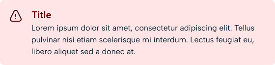
Tooltips & Labels:
Always pair standalone icons with tooltips or labels for better comprehension.
When to Use Icons
Use icons where visually distinguishing a list of actions or data points could be useful. Always accompany an icon with text, unless it is a very commonly used concept or you have user research indicating it is understood alone.
- To represent actions (e.g. edit, delete, submit, save).
- To enhance the navigation (e.g. home, settings, profile).
- To provide feedback (e.g. success, warning, error).
- To reinforce content meaning (e.g. categories, tags, file types).
When Not to Use Icons
Use icons cautiously. By themselves, they are rarely understandable in terms of their function. Avoid using additional icons when there are already many on the page. Adding more icons in this situation can lead to visual noise and clutter, and diminish the usefulness of the icon.
- If they do not improve usability or understanding.
- When textual representation is clearer.
Design guidelines
Sizes:
To maintain consistency and usability, follow these size recommendations:
- Small Icons (16px - 24px): Used inline with text and in compact UI elements.
- Medium Icons (24px - 32px): Suitable for navigation menus, buttons, and interactive elements.
- Large Icons (32px - 48px): Used for status indicators, media controls, and prominent UI components.
- Extra Large Icons (48px+): Reserved for banners, illustrations, or emphasis in special sections.
- Ensure icons scale properly on different screen sizes and resolutions.
Formats:
SVG - Preferred for scalability and customisation.
PNG - Alternative format
Colours:
Figma colour:
Primary colour:
Inverted:
Destructive (Needs reviewing)
Success (Needs reviewing)
Do:
- Use clear, recognisable icons.
- Provide explanations where necessary.
- Ensure consistency across the design.
- Use lightweight SVG files for faster loading and better scalability.
- Group related icons logically to enhance comprehension.
Don’t:
- Overload the UI with too many icons.
- Use ambiguous or brand-specific icons without explanation.
- Rely solely on colour to convey meaning.
- Use icons with excessive details that reduce readability at small sizes.
Mobile considerations:
tbc
Accessibility:�
- Avoid relying on icons alone. If an icon is used without text, ensure that the alternative text for the icon indicates its purpose (e.g. "Add attachment") and not its name (e.g. "Paperclip").
- If an icon is purely decorative it doesn't need to be read by a screenreader.
- There should be a colour contrast rato of 4:5:1 between the icon and background.
- Users should be able to navigate to the icon using a keyboard, have a clear indication when it is selected and action it using the Enter or Space keys.
- The contrast ratio of focus indicators and the background must be at least 3:1
- The icon should be correctly sized and users should be able to increase icon size by 200%.